
how we created the poster!
|
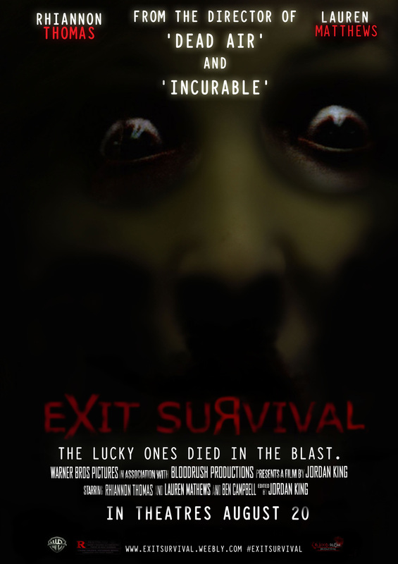
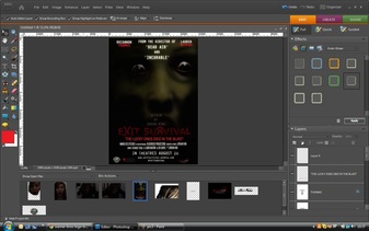
Firstly, we focussed on designing the background for our poster, which we wanted to be dark as we wated to represent our horror trailr in this way because we plan to use a series of dark locations to film our trailer in. therefore we chose to use a black background where we would blend our image into.
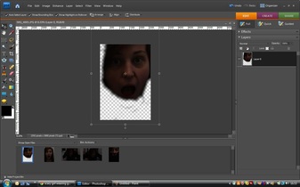
we began by importing our image into Photoshop and using the eraser tool to take out the unnessesary areas of the image until we had the basic outline of the image we wanted to use on our poster. we altered the opacity of the eraser to give a more blended finish to the edges of the image and reduce the obvious clear cut edge we would have had. (jordan) |
|
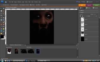
We then added the image to our black background and altered the eyes of our victim, in order to make them seem both possessed and petrified. we wanted the image of the victim to be the iconic figure for our trailer, and most predominantly the eyes. we therefore looked at a series of existing horror posters and decided that we found the 'Mirrors' poster that looked allot like what we wanted to do. we therefore edited the eyes of our victim in order to give them the same effect. This was the most single long process of the creation of our movie poster. (jordan)
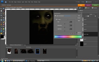
After this, we decided to adjust the colour of the victims skin, in order to make them more obviously possessed. to to this we created a 'duplicat layer' of the image and on the top layer, we adjusted the hue/saturation o give a slight green tinge to the skin, whilst on the bottom layer, we added a 'Gaussian blur' which gave a distorted effect. we then reduced the opacity on the top layer so that the blure on the lower layer was more visible. (jordan) |
|
Finally, after our image and background were complete, we added the text and credits for the poster. The fonts for the texts were created and added in photoshop and we used certain tools to make the titles more unique. for example in our title 'EXIT SURVIVAL' we used the basic 'Arial Black' text but we mae it look unique by using the eraser tool to give a distorted effect to the text.
we added many other parts to the poster to make it look more realistic. these include: - actors names - Cross-promotion of our film we created during our 'A2' studies - credits including producer, istributor, actors and creator - logos for distributor and producer as well as restricted 'R' - release date and tagline for our horror movie (jordan) |
