
'The Last Exorcism' (2010)
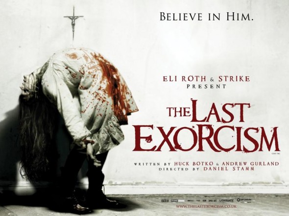
We looked at exisiting film posters for our chosen sub genre of horror; Paranormal. We looked at 'The Last Exorcism' and thought this was an effective film poster because the image used of the girl immediately highlights the sub genre of the movie. The mutated form of the girl on the poster shows that it is in the genre of Paranormal and makes people fear it because it looks unnatural. By making red the only prominent colour on the filom poster it makes the title stand out more and also shows the blood and gore invoved in the film. The white background is a connotation for innocence and purity which contrasts with the genre and image shown. The text ‘Believe in him’ creates fear as it’s a warning. (jordan,rhianon,lauren)
'Mirrors' (2008)
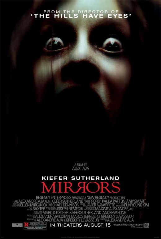
We looked at the film poster for
the film 'Mirrors'. We thought this poster was effective because the
dilated pupils on the character show how scared she is but it also makes it look
like she is staring at you. Also the low key lighting around the face gives a
sense of mystery and danger and also makes the white around her eyes stand out.
By having part of the face in shadow with only the eyes standing out makes it
look even more mysterious and creepy. It has the title in red which makes it
stand out against the dark background but might also reflect the gore of the
film. By having one of the R's in 'Mirrors' reversed it makes it look like it is
mirroring the other R and also makes the title look a little distorted. The
poster is also effective because it has links to other films by saying 'From the
director of 'The Hills Have Eyes' which will make people who have seen
that and enjoyed it want to see this film as well. (jordan,rhianon,lauren)
'The Uninvited' (2009)
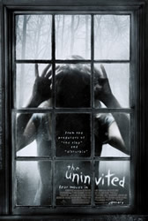
We also looked the film poster for 'The Uninvited' . We thought this was an effective film poster because by showing someone looking through the window it creates the feeling that you are constantly being watched and by having the face in shadow it also creates the feeling of mystery and might make some people uncomfortable and uneasy. From the background in the poster it shows the Carol Clover theory, that bad things happen in bad places. The faded background with trees in the background also suggests that they are in quite an isolated place, which adds to the feeling of mystery and uncomfortableness. We have found with most horror posters that they mostly all use the colour red with very plain colours, but this poster is only mainly in black and white making it feel more mysterious and suggesting it is more based on the paranormal than blood and gore. The font used to display the title 'The Uninvited' makes it look like it has been written on the window making it look creepy and mysterious. (jordan,rhianon,lauren)
'Drag Me To Hell' (2009)
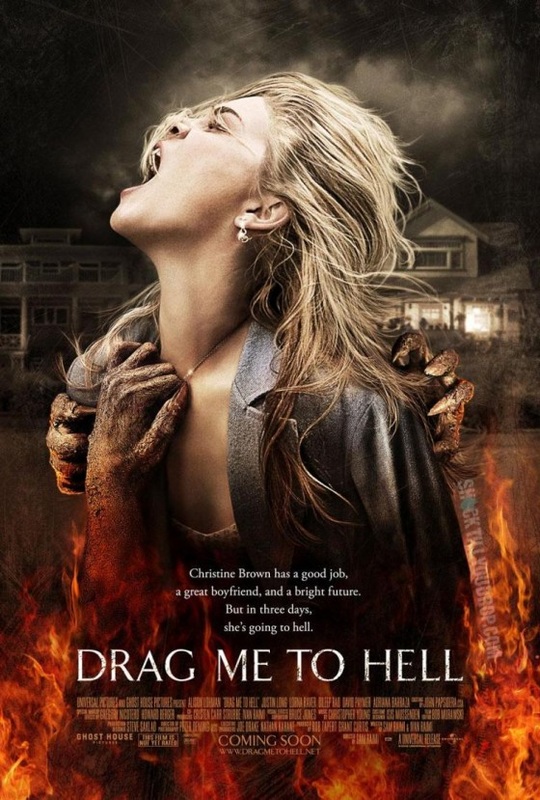
We looked at the film poster for 'Drag Me To Hell'. The low colour saturation on the girl suggests she is not unique and is just another “hell victim”. The background reveals the location of the movie, which appears to be a normal neighbourhood and follows the theory of Carol Clover that 'bad things happen in good places'. The dark drained background in contrast with the vibrant colours of the flames, which we suspect represents hell on the poster, shows how these flames and hell are the dominant power over the real world. The hands grabbing the girl show how she is being dragged to hell. The girl on the poster is also blonde which follows Carol Clover's horror theory about the victim usually being a blonde girl and this is a convention of horror. When we compared this to most other horror posters we found that most of them used the colour red for their title and we found thst this one used white so that it would show up on the vibrant flames. (jordan,rhianon,lauren)
